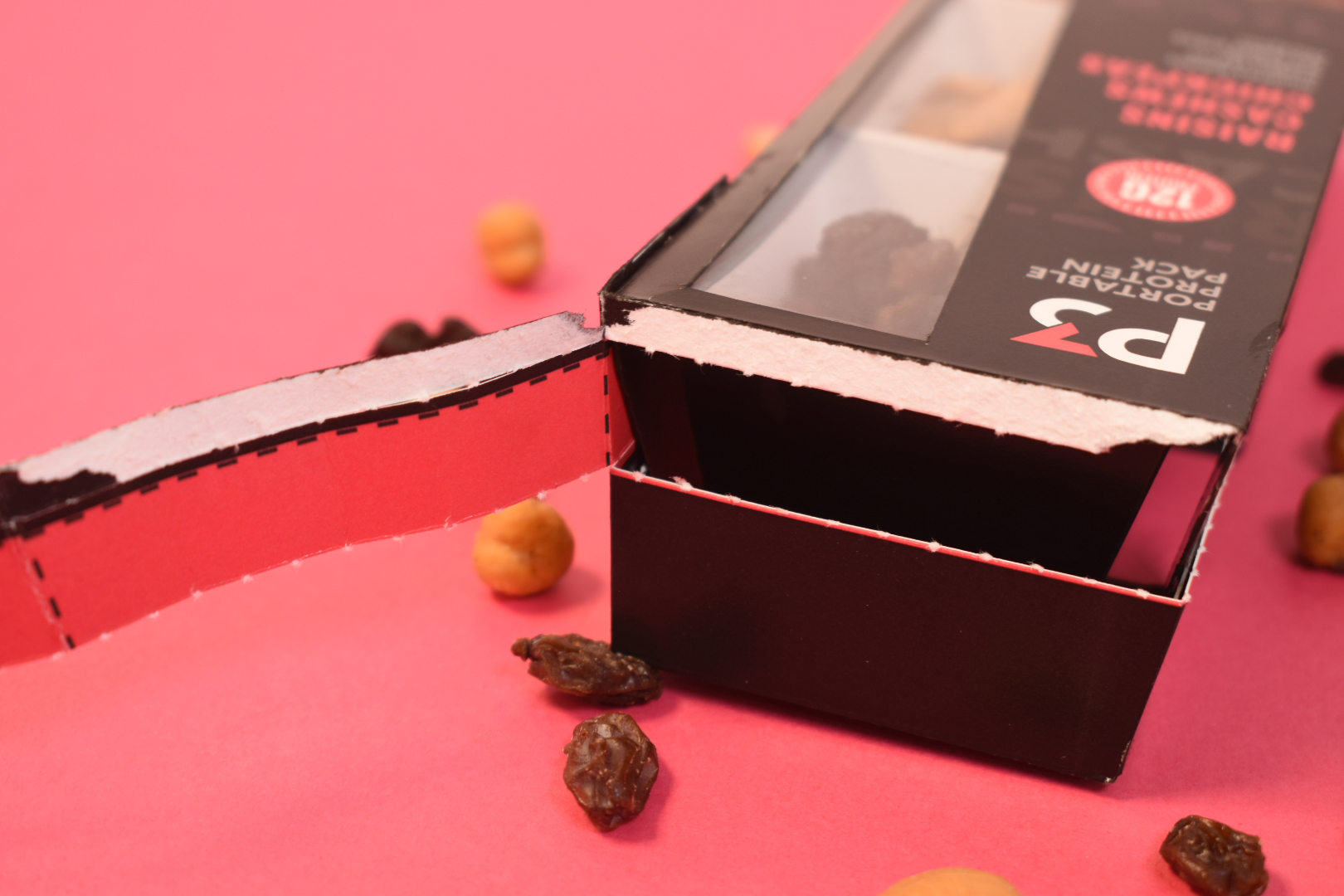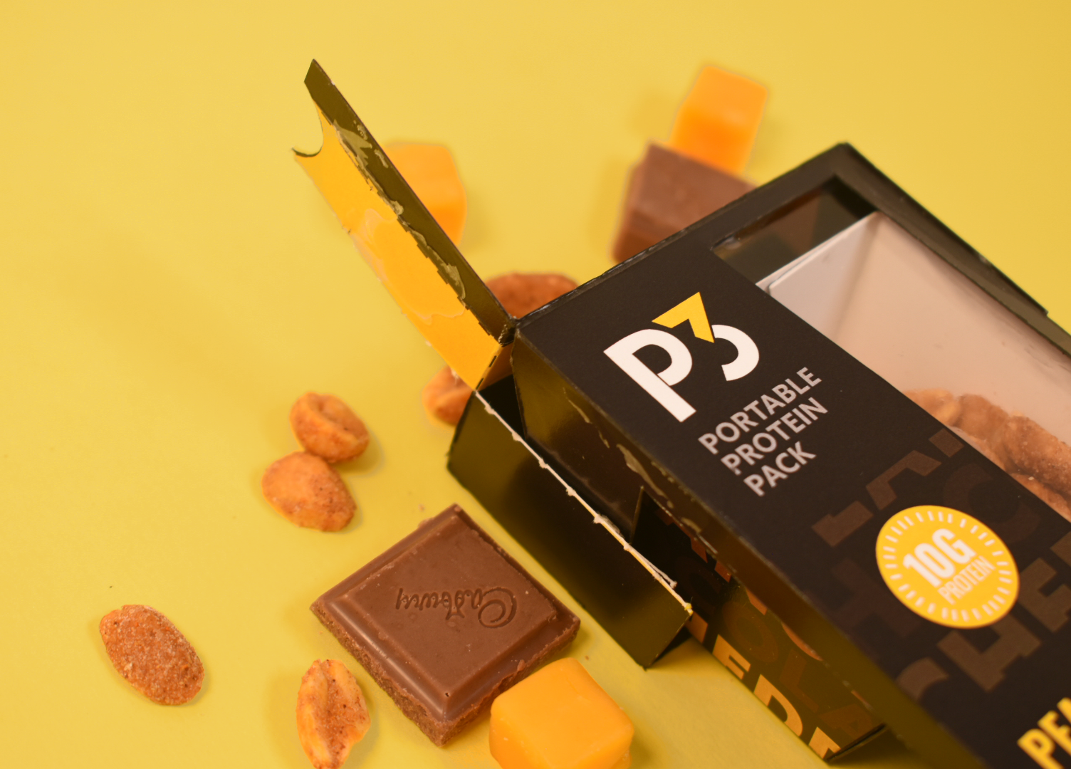
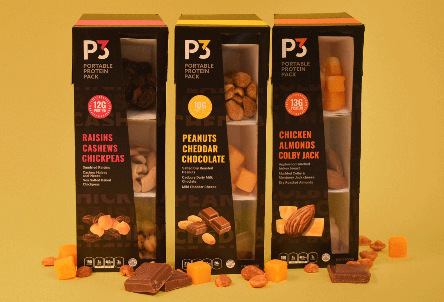
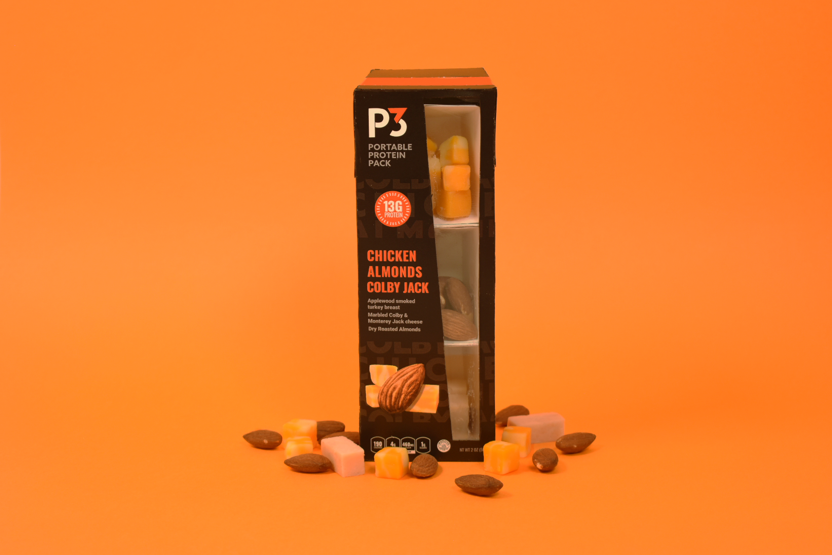
I chose to redesign P3, portable protein packs, to give them a new look that could draw in college students. Currently, the markets on camps lack vegetarian and vegan food options, so I also used this packaging assignment to try to meet those needs.
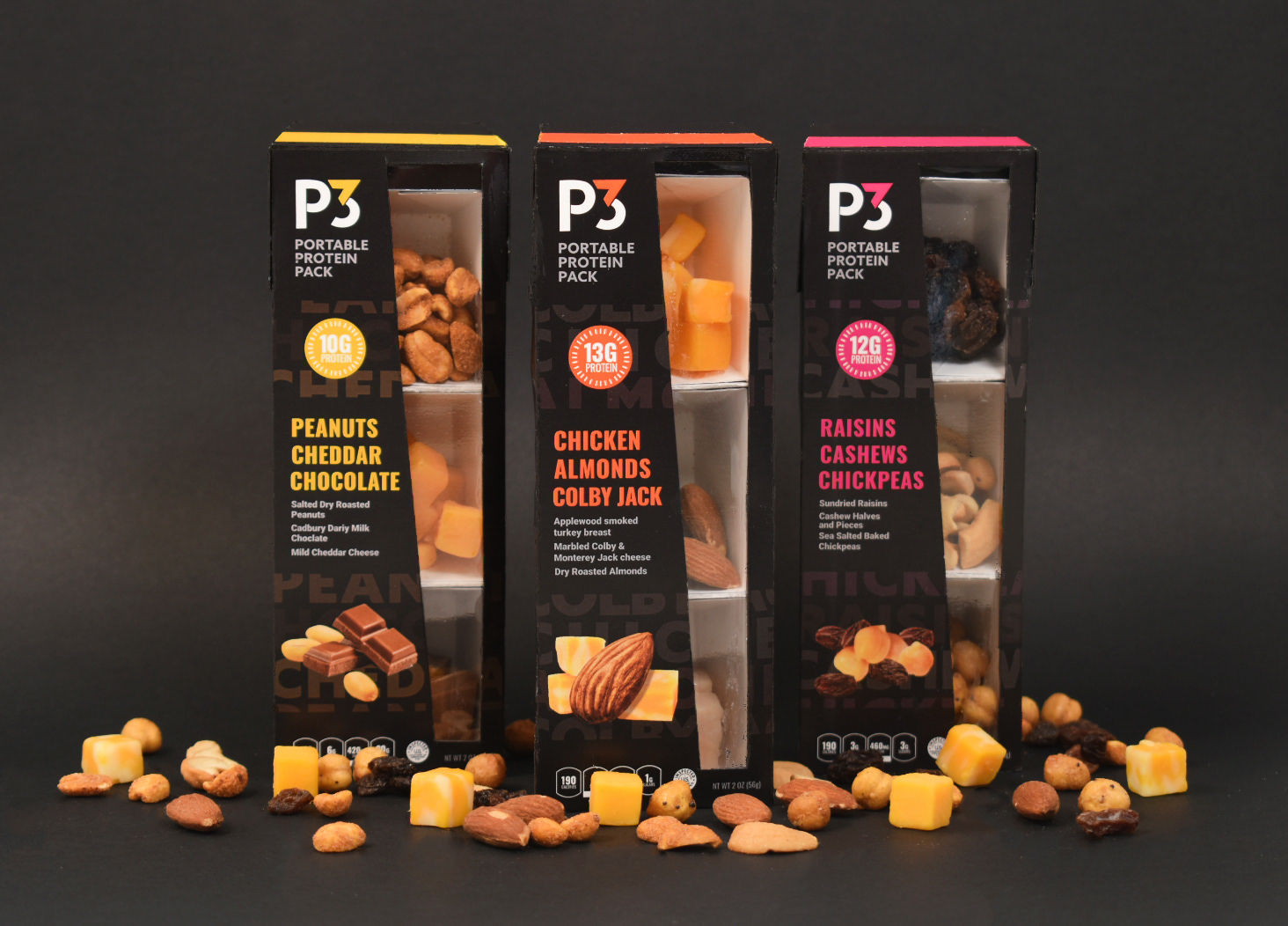
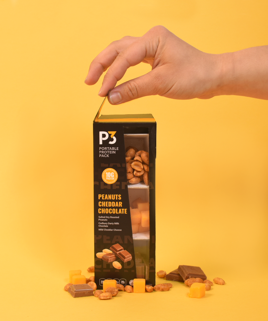
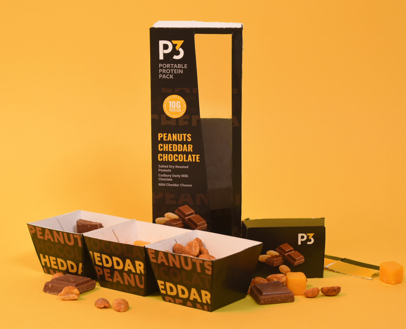
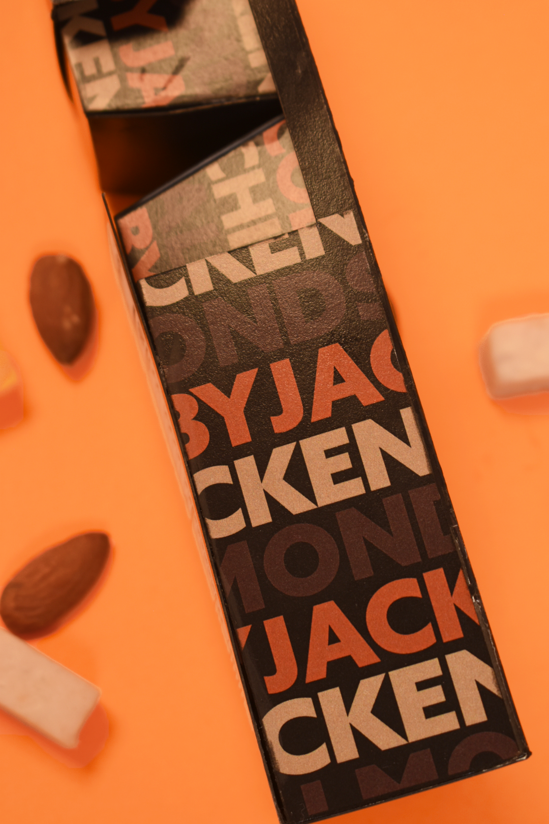
Overall I wanted the look of this package to feel bright and bold but not over the top or in your face. To accomplish this I used limited, bright accent colors and tones on the packaging to create the bright feel I wanted and to help customers differentiate between varieties.
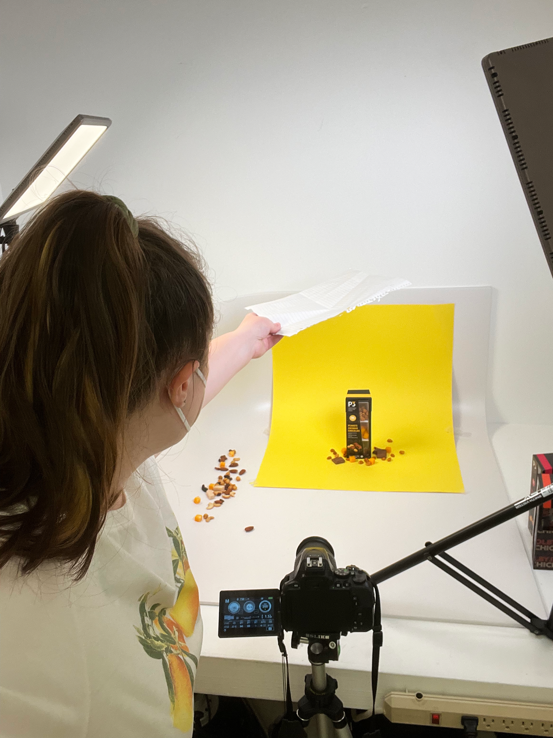
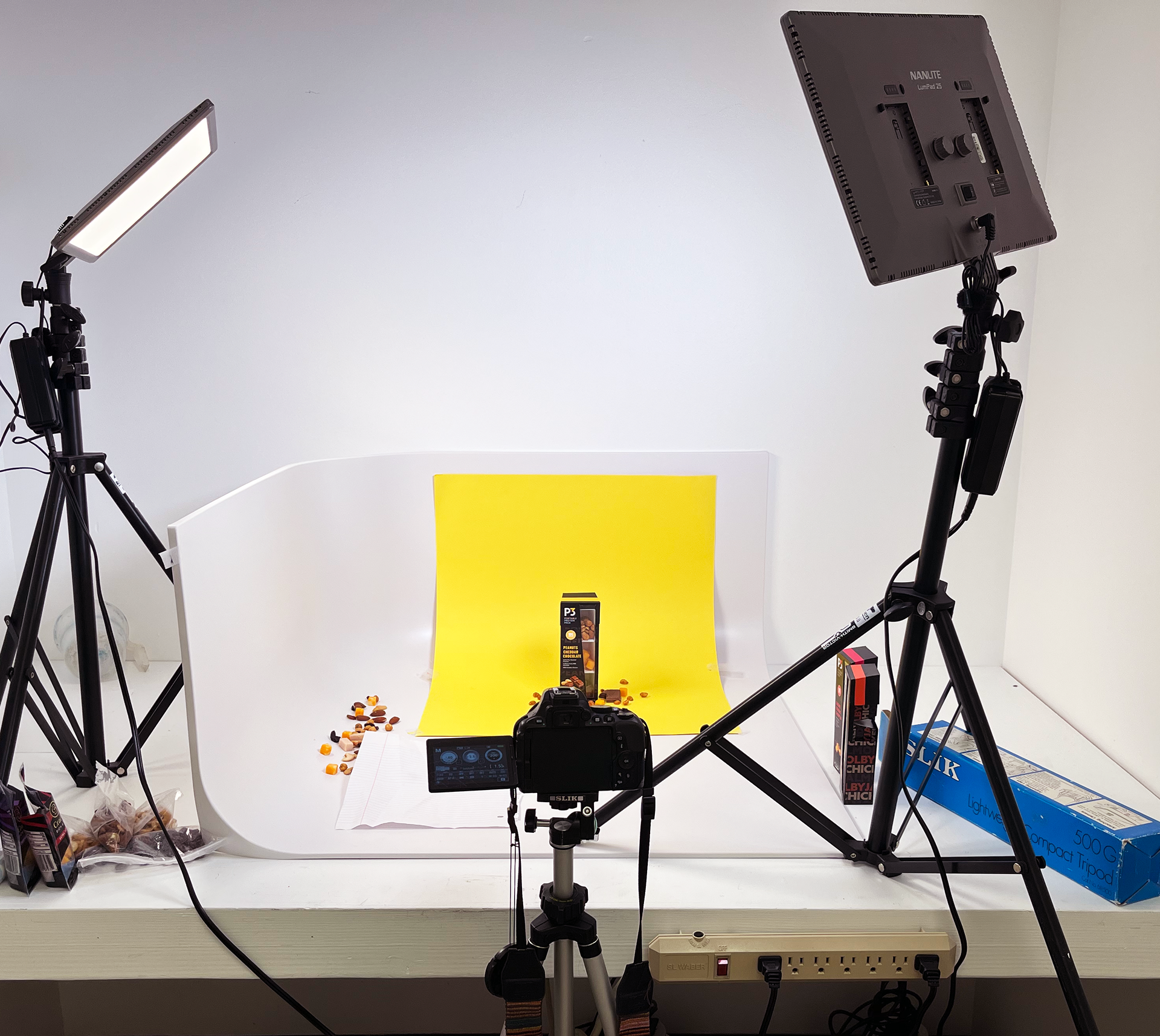
For this project I also wanted to try to do a more thought out photoshoot of my packaging. The theme for the photoshoot was bright and bold to not only highlight the foods inside the packaging but the colors used in the packaging. I have never tried to do a full out photoshoot before, but I definitely will be doing it again in the future if I can!
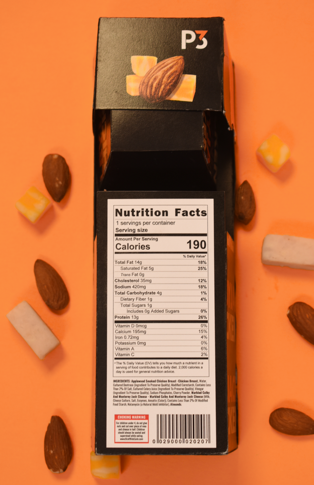
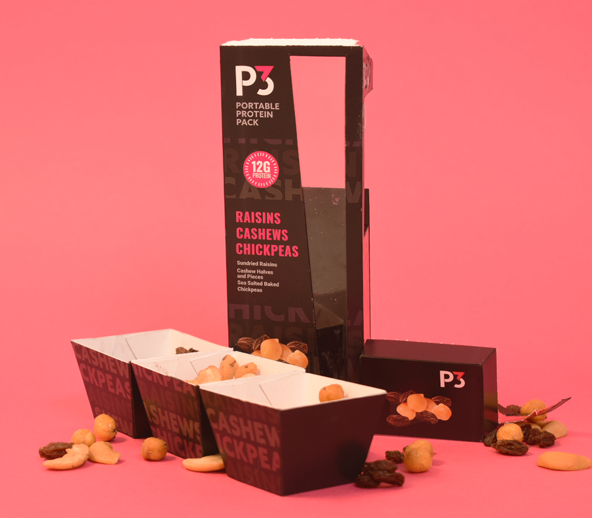
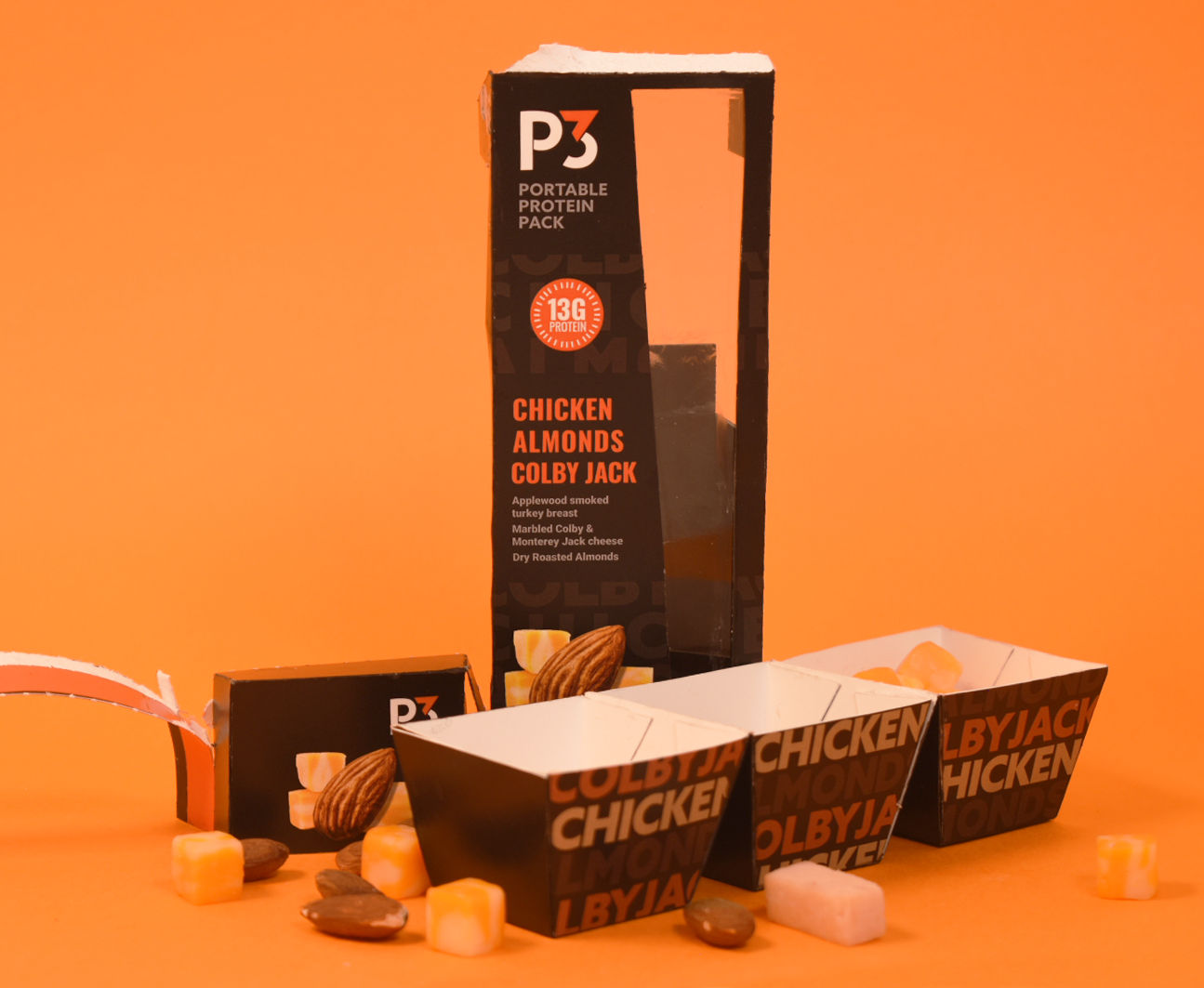
The Box opens through a pull tab at the top. Once that is pulled off then you can pull out the box inside.